Swish Oral Care
Swish Oral Care came to the design team with the ambitious goal of reinventing dental care for its patients. It is their belief that clarity, communication, and comfort can make the world of oral care a lot less daunting. They desired a design forward interior resulting in a user centered environment that reduced anxiety, increased transparency, and contributed positively to a patient’s health and wellness.
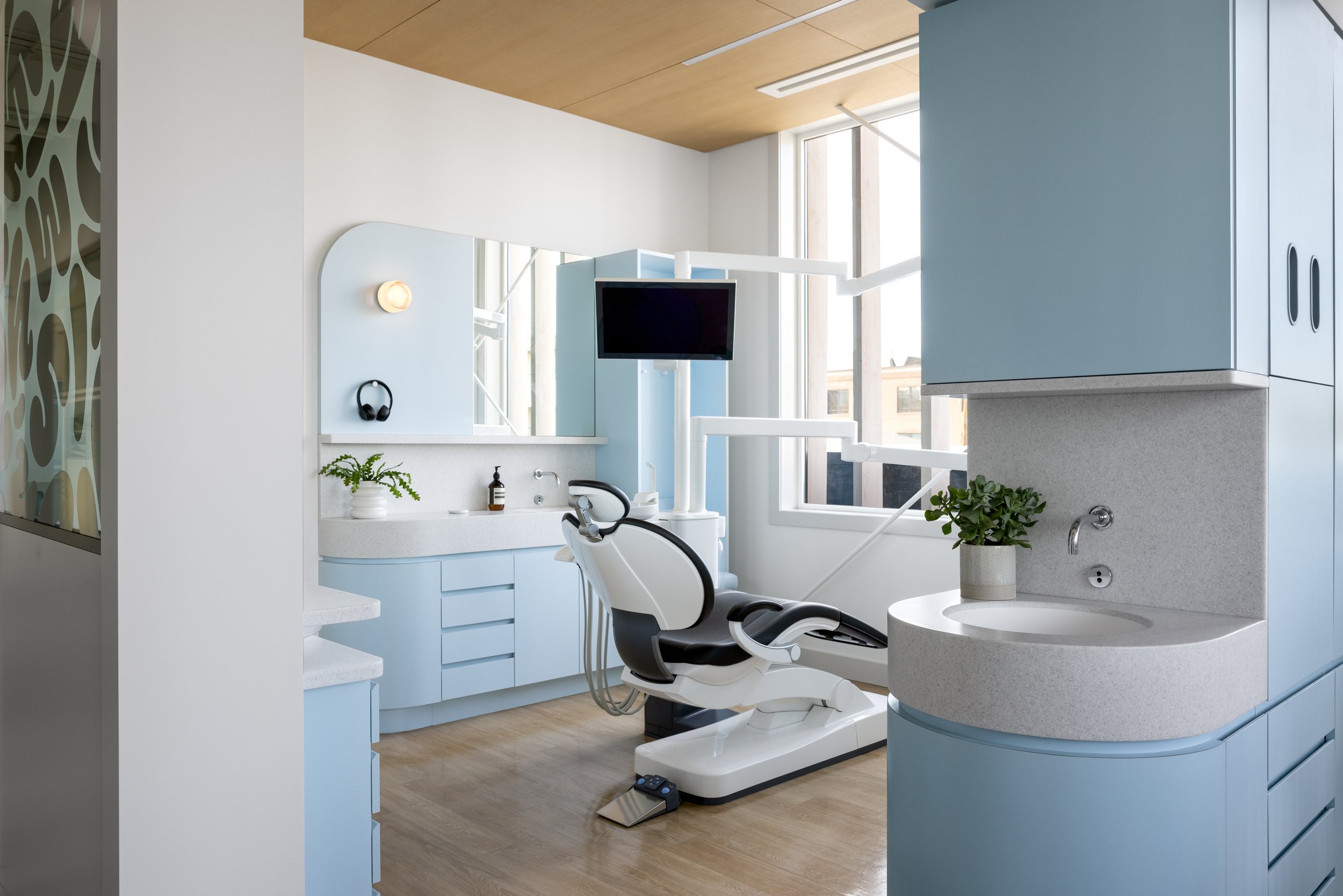
The design team conceived of a space that exudes softness. Upon entry, you encounter an elongated reception desk clad in swirling white Corian. The material palette was kept intentionally minimal. White was used liberally to create a bright feeling of cleanliness and spaciousness. Pale blue was used as the primary accent colour for its calming qualities. The Swish Bar was painted a bright, friendly yellow signaling a fun end to your dental visit, while also providing a landmark to ensure easy navigation through the space. Cleanliness was at front of mind when designing the operatories. Sensor faucets are used throughout the facility with integrated Corian countertops and sinks to minimize any seams. The operatory millwork is finished in laminate with integrated finger pull reveals to create a streamlined appearance.
The design team also had the unique opportunity to marry elements of the building architecture with the interior design to create a holistic experience. The rounded curve of the exterior was mirrored in details throughout the space and reflected in the toothpaste inspired branding elements that were incorporated. The slatwork on the exterior was replicated in the design of the walls surrounding the Consultation Room.
Biophilic design principles were applied throughout the space, as they are proven to reduce stress and increase pain tolerance. All patient areas feature access to natural light and views to the surrounding park and neighbourhood and are mentally restorative for occupants. The floorplan was designed to be navigated as intuitively as possible for patients, with a single corridor extending from reception through to all operatories. White oak paneling was relied on heavily to provide a warm, natural materiality throughout the space. Plants were incorporated throughout including a climbing planter in the reception window.
Playful branding applications in signage, glazing graphics and neon signage inject surprising moments of amusement into the client experience, further deinstitutionalizing the space and elevating it to a space of unexpected joy.
Completed June 2022, Calgary, Alberta | Client: Adam Jiwani & Alim Kassam | Brand Design: Bamff | www.swishoralcare.ca
It was an absolute pleasure working with Sarah Ward on Swish. It was a demanding project with a lot of moving parts and Sarah's calm demeanor, thoughtfulness, attention to detail, ability to adapt to change, and work collaboratively with the other consultants on the team really helped get us over the finish line.
Adam Jiwani, Swish Oral Care


